 |
| Fig 1: Layout Thumbnails for the Exterior |

Showing posts with label Thumbnails. Show all posts
Showing posts with label Thumbnails. Show all posts
Thursday, 16 March 2017
Adaptation B: Pawnbroker Exterior Layout Thumbnails

Wednesday, 24 February 2016


Wednesday, 2 December 2015
Production Art: Additional Building Layouts
 |
| Fig 1: Square Two Floor Building Layout Drafts |
 |
| Fig 2: Square Building Layout Drafts |
These are some more production art drafts/layout designs for the remaining two of my five buildings for my digital set, before I use the best ones to make orthographs out off.
Wednesday, 25 November 2015
Production Art: Building Layout Ideas/ Doors and Windows Thumbnails [Feedback Please]
 |
| Fig 1: Door Designs |
 |
| Fig 2: Window Designs |
 |
| Fig 3: Green Building Designs |
 |
| Fig 4: Blue Tear Shaped Building Designs |
 |
| Fig 5: White Building Designs |
I made up some additional production art thumbnail pieces of my buildings as a result of the feedback from my OGR, regarding windows and doors being too generic and how they dont connect to the rest of the city. From this I went to research into old spainish buildings and experimented with basic shapes. I have the colours for the buildings relatively set already, as shown from the final concept piece, so all I wanted to do here for the moment was sort out the layout of the building structure and of the designs of the windows and doors. this was done as a way to see if I am on the right track with these before neatening them up in Illustrator. So feedback is very much welcome!
Monday, 16 November 2015
What if? Metropolis: Colour Compositions


Here are some colour compositions I've done for my final concept art ideas. I wanted to keep the red sun as a fundamental part of my city, I have it heavily featured in my travelogue and it's part of the upper city of Pilar's "culture". So red highlights would feature a lot in the piece. However I might go back and try out different types of highlight, (like making the red softer or harder in tone perhaps). Some of the colours used are based on the background colours Miró himself uses, while others were experimentation with some Photoshop Adjustment Layers.
What if? Metropolis: Production Art-Concept Ideas

I plan on doing more in the future that aren't as focus on Miró's work and are more influenced on his use of shape and colour placement instead.
Thursday, 12 November 2015
What if? Metropolis: Thumbnails 76-81 [Final Concept Art Drafts]
 |
| Fig 1: Thumbnails 76-77 |
 |
| Fig 2: Thumbnails 78-81 |
 |
| Fig 3: Thumbnail 81 |
In these Thumbnails I'm trying to figure out how to set up my final concept art. I want to have a sense of scale from the feminine buildings of the town square (based on Miró's pieces "Nude, 1926" and "Portrait of Mrs Mills in 1750 (after Constable), 1929") to the towering figure of the building dedicated to the red sun at the top of the hill, which I plan to do as part of the Matte Painting. I want to work on perspective more for this, so Thumbnails after this will be just about sorting out that as well as experimenting with building placement, whether to make it symetrical or asymetrical.
Sunday, 8 November 2015
What if! Metropolis: Thumbnails 38-75
 |
| Fig 1: Thumbnails 38-40 |
 |
| Fig 2: Thumbnails 41-50 |
 |
| Fig 3: Thumbnails 51-60 |
 |
| Fig 4: Thumbnails 61-70 |
 |
| Fig 5: Thumbnails 71-75 |
For these thumbnails I did them in photoshop, and focused more on the structure of my city and how I can base it on Miro's original work, looking at references of his art when I was stumped on ideas and using it as a base for some of the thumbnails.
Tuesday, 3 November 2015
What if? Metropolis Thumbnails 21-37 [UPDATED]
 |
| Fig 1: Thumbnails 21-23 |
 |
| Fig 2: Thumbnails 24-27 |
 |
| Fig 3: Thumbnails 28-30 |
 |
| Fig 4: Thumbnails 31-33 |
 |
| Fig 5: Thumbnails 34-37 |
I was experimenting with some new inks I got earlier in the week and tried to encorperate Miró's sense of colour in some of the thumbnails, I also came up with other ideas about how the city would work.
[EDIT]- I retook the photos under some better lighting, they should be less tacky and look clearer now.Sunday, 1 November 2015
What if? Metropolis: Thumbnails 1-20 [UPDATED]
 |
| Fig 1: Thumbnails 1-2 |
 |
| Fig 2: Thumbnails 3-4 |
 |
| Fig 3: Thumbnails 5-7 |
 |
| Fig 4: Thumbnails 8-10 |
 |
| Fig 5: Thumbnails 11-13 |
 |
| Fig 6: Thumbnails 14-16 |
 |
| Fig 7: Thumbnails 17-20 |
Then as you progress up into the city the buildings get more and more abstract in their design, until towards the peak of the hill it has buildings reflect his latest works and hiss sculptures like "Sun Bird, 1968", "Model for La Défense,1975" and "The Caress of a Bird, 1967". I especially like the last sculpture as its design is really memoreable and appeals to me so it features in many of the thumbnails shown.
[EDIT] I retook the images so that the focus is solely on the thumbnails.
Tuesday, 20 October 2015
Colour Comps Low Angle Exterior and Interior Shots
I drew some more colour comps, primarily focusing on the exterior low angle and the interior shot and the perspectives of each, with the help of Jordan, by copying the original image and scaling it down to include more of the environment. I wanted to have a more layered approach, by having a foreground, mid ground and background.
For the exterior low angle shot, I wanted to have the street lead to the market hall where the interior shot is based. Putting it near the ocean to give the sense that the city does lots of trading of the coast. For the final piece, for the interior I will included more items for the travellers travel in from the desert. Such as carpets and traveller gear for the harsh sun.
 |
| Interior Shot |
 |
| Low Angle Exterior |
Sunday, 18 October 2015
Photoshop: Buildings and Building Collage Thumbnails
 |
| Fig 1: Building concepts |
For the buildings I decided to produce a lot of tall buildings with odd shapes. As this would of given the sense of how tall the city is. However when I was placing the buildings in a collage I had some trouble of where to place the awkward tops of some of the structures. So I have decided that for the final pieces I'd go for something a bit more simple but still have that depth and uniqueness that the buildings here have.
I also really like the angle I put the city, in the first image of the collages. I most probably will have that angle feature in one of the final pieces to give a more dramatic feel, and to be able to give a sense of range for Despina.
 |
| Fig 2: Building Collage |
Thursday, 15 October 2015
Photoshop: Master Study and Abstract Thumbnails
Here is my Master Study works and the Abstract Thumbnails of Baucis with and without the lasso tool, then I merged them together. I enjoyed using the lasso tool but I had a few issues with merging the two, I feel as though I should of experimented with masking and some of the layer options a bit more.


Monday, 12 October 2015
Invisible Cities- Additional Thumbnails: Despina
Now then I have come to realise my mistake while I was writing up my OGR, and thanks to the feedback I re-read the description to Despina and saw that I only thought of half of the city's looks. So to combat this ignorance of mine I drew up some more concepts, from both the camel's view and the sailor's view. I also thought that the city would have different influences depending on what side you are looking at, from the sea you'd see more arabic inspired buildings, domed roofs with rusted reds and browns. While to the desert side it would be more modern day european holiday city like in my original concepts. I also need to look into the formations of Desert sand and of the Sea for futher research of their natural structures.
 |
| Fig 1: View of Despina from the ship, I wanted the main figure of the city from this view to look like a bactrian camel |
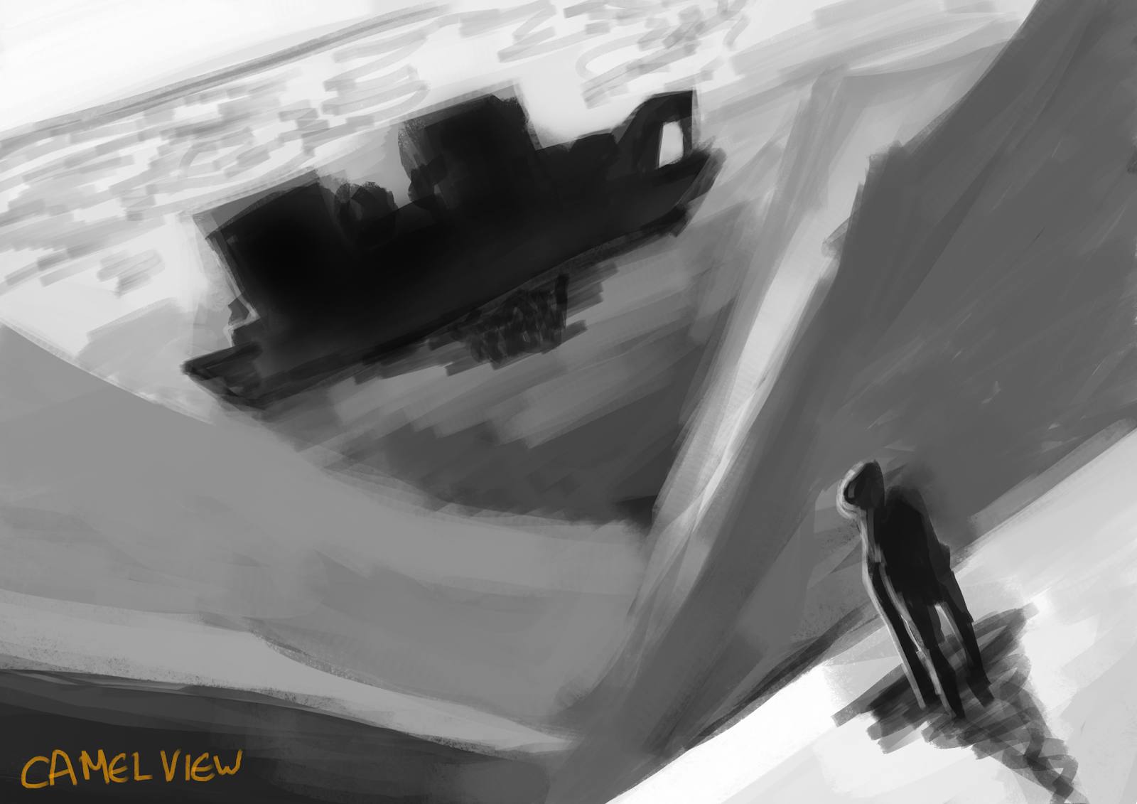 |
| Fig 2: View of Despina from the camel, I tried to make the main silhouette of the city look as much as a tanker as possible |
 |
| Fig 3: rough concepts of the second shot of the city, I need to use more of the perspective tips from the Photoshop Lessons to improve this but its a start. |
Wednesday, 7 October 2015
OGR: Invisible Cities
Scribd. seemed to enjoy resizing all of my slides, I have tried fixing it but it still messing things up.
Monday, 5 October 2015
Invisible Cities 82-101
I found the cities in these last 20 thumbnails to be very interesting, and I had fun drawing them, especially Marozia dual cities and Andria was enjoyable to draw aswell. I also did some more thumbnails for Despina just because I wanted to be a bit more sure of the colours I'd like to use, mainly being orange and blue along with white and red.
 |
| Thumbnails 82-91 |
 |
| Thumbnails 92-101 |
Invisible Cities 52-81
 |
| Thumbnails 52-61 |
 |
| Thumbnails 62-71 |
 |
| Thumbnails 72-81 |
Invisible Cities: 44-51
 |
| 44-45: Ersilia, 46: Leandus |
 |
| 47-51: Esmeralda |
Subscribe to:
Posts (Atom)