Showing posts with label Concept Art. Show all posts

Thursday, 28 March 2019

Major Project: Concept Art for Props and House Variations for Road Set

Fig 1: Variations of Houses for the Road set


Fig 2: Designs for Mr Plimsoll's Bag
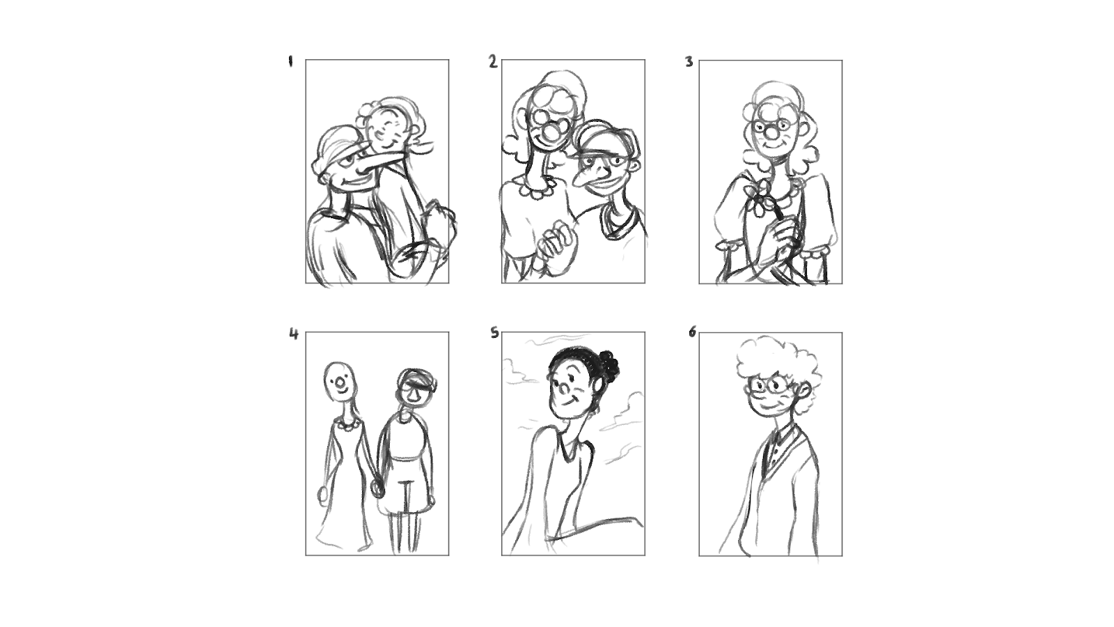
Fig 3: Concepts for the Photo above the Fireplace in Mr Plimsoll's Living room
Here are some concepts for the bag Mr Plimsolls carries around in the first act of the film, variations of the houses that will be seen in the background of the road set for the same scenes and thumbnail ideas for the picture of Mr Plimsolls' wife that will be in a picture frame above the fireplace in Mr Plimsolls' living room.

The House variations are just to give the background of the road set a bit of character as Mr Plimsolls walks by. The houses are similar but the differences are in the features of them, and my plan is to take 3-4 of the designs to use for that set.

For Mr Plimsolls' wife I wanted to go for a character design that was quite hidden in terms of who she is, but for her to be portrayed as a positive person in Mr Plimsolls' life so having her also smile but be smiling in a way that is opposite to Mr Plimsolls, instead of being creepy, her smile is more genuine.

Friday, 22 March 2019

Major Project: Environment Concept Art 02


Fig 1: The Road Mr Plimsoll's lives on
Fig 2: Mr Plimsoll's Living Room
These two concept arts depict the road Mr Plimsoll lived on and his living room for the ending scene. The idea for the road was that it would rotate as Mr Plimsoll's walks down the road, so to emphasise that idea the scene was drawn using curves and perspective was taken into account.

Mr Plimsoll's living room was design with the idea that Mr Plimsoll's was just a man who went through the trauma of losing his wife. To show that he reminisces the time he spent with his wife, I had the idea of the room having many picture frames with pictures of them as a couple. The run down aspect is more due to the fact that because of his old age he wasn't able to keep up with the house keeping. As well as preferring to spend the majority of his time outside of his house, wandering around the town instead of staying indoors wallowing in loneliness.

Wednesday, 27 February 2019

Major Project: Environment Concept Art 01

Fig 1: The Front of Mr Plimsoll's House

Fig 2: View of the Churchyard from Mr Plimsoll

Fig 3: Mr Plimsoll's Bathroom
For these environments I looked at background art of cartoons in the 1920's-1930's, with the exception of the Bathroom. I wanted the environments to fit with the character of Mr Plimsoll's, his house looked over grown and spooky to the children of Park Avenue. The bathroom on the other hand I wanted it to look like it is in the perspective of Mr Plimsoll's and his discovery of his wife in the bathroom, so I played with distortion to the furniture and walls, the perspective isn't correct at all to add to the off putting feeling that I want this scene to have in the final film.
Overall while I like the process I'm making with these environment designs and they are able to convey the scenes clearly, I feel as though I can push the creepy, overgrown nature of Mr Plimsoll's house further.

Sunday, 28 October 2018

Minor Project: Mr Plimsoll's House and Road Concept

Fig 1: Concepts for Mr Plimsoll's house


Here are some initial designs of the bungalow that Mr Plimsoll's lived in. I initially didn't aim for an exact representation of the actual house Mr Plimsoll's lived in, I wanted to experiment with drawing a different styles of bungalow and how I could use the house in some shots for animation. This is why there are a few designs with one window as I had in mind a shot of the camera looking into the window at Mr Plimsoll's looking out. This idea was based on my Mum's account of her nightmares about him looking at her through the window of his house.
However when I showed the designs to my Mum's friend who lived on the same street, they pointed more towards the houses with two windows on either side as a more accurate representation of the house. They also plan on sending me images of both the house, the street as well as a photo of a street party that might have Mr Plimsoll's in it.


Fig 2: Concept Ideas about the street Mr Plimsoll's Lived on


The street where Mr Plimsoll's lived is on the opposite side of a church, there is also numerous trees along the pavements that I want to include in final designs of his street, the reasoning is that it brings more variety to the road. I want to add the neighbouring houses to help in showing that Mr Plimsoll's house is different and spooky. In comparison to the lighter coloured houses, his bungalow is darker in tone and very dilapidated. 

Wednesday, 27 December 2017

Minor Project:O'Barney Orthographs

Fig 1: Final Design for O'Barney

Fig 2: O'Barney Body Orthographs

Fig 3:O'Barney Head Orthographs 
From the feedback I received on the previous post, this is the final result for O'Barney. In the orthographs for the head I included an unhooded O'Barney to help in understand how the hood of his raincoat would Rest on his head.

Thursday, 7 December 2017

Minor project: O'Barney Continuing Design

Fig 1: Continuing Designs for O'Barney by Exploring Body Types
Here are some more concepts for O'Barney, coming off from the Interim Crit where admittedly he was my least thought out design of the three bogeymen characters I went and re-evaluated his design and played with some body types, as well as some raincoat and macintosh designs from around the 1980's which is the time when Matthew, the person I got the description of O'Barney, would of been a child. While i liked the idea of him having a blank stare I felt like that restricted the character a little so while I kept the round eyes I made him look more angry and threatening.

Sunday, 3 December 2017

Minor Project: Mr Polo Final Design and Orthographs

Fig 1: Finalised Design for Mr Polo


Fig 2: Head Orthographs
Fig 3: Body Orthographs

Fig 4: Additional notes for Mr Polo's Scarf
This is my finalised design for the character of Mr Polo for my Project. His design is significantly simple in comparison to Mr Plimsoll, he doesn't have visible legs, something that would be a challenge to create in 3D, however due to the description on the character mentioning how he appears to "glide along" I felt like it was a direction suitable to the character. Although, as I go about the modelling process, I might widen the end of his coat slightly just to allow for minor leg motion when it comes to rigging. As well as this I wasn't sure if I should include a mouth on him or not, considering his face is mostly covered with his jumper and scarf I didn't think it would be too necessary to include one. However if I do end up giving him a mouth I would probably add it in 2D as a time saver instead of modelling a mouth that would barely be seen.

My main concerns over modelling this character mainly revolves around how to model his eyes and the process of making his scarf despite the fact that I was able to make one in my previous project.

Thursday, 30 November 2017

Thursday, 16 November 2017

Minor Project: Mr Polo Continuing Design

Fig 1: The Two Designs that were most popular from the Second Character Concept Post


From the feedback provided for my previous post about Mr Polo, these two designs were the most popular, however I got feedback in that while these two concepts are the most successful in understanding the description given for him, they still weren't that creepy or monstrous. 

From being giving this feedback I went back and looked at how could I make this character look scary while keeping the round features that were key to the character. I looked at some Popeye the Sailor cartoons featuring the character Wimpy, one of my influences for this character and found that in the short movie "Shiver Me Timbers" that Wimpy's eyes open when scared which is in some way a bit disturbing. How skeletons and ghosts are portrayed in 1930's cartoons also picked my fancy due to how the "eyes" on those characters appear to be empty by how they apply black to the circle of the eye, similar to shading the end of a cylinder at a 3/4 view. 


Fig 2: Characters that helped influence the creepiness in Mr Polo
(Wimpy from Popeye the Sailor (Image from the animation "Shiver Me Timbers" 1934), Skeleton from the Tom & Jerry animation "Wot a Night", 1931, and a ghost from the game Cuphead)


With these ideas I got to making some designs, based on the 2 original designs from the previous post, and started to mess around with this idea of empty eye sockets and just complete large black eyes in general and seeing how they look with the character. I feel like number 2 I was more happy to play around with his body but I also like number 4 for the fact that only certain expressions would show that concept off however my only concern would be about how expression would he be to allow him to show emotions like surprise or anger to allow for his eyes to show fully? 

Fig 3: Continuation of the Designs including Addition Notations

Wednesday, 15 November 2017

Minor Project: Mr Polo Character Concept 2

Fig 1: Mr Polo Character Concepts
I went over my designs for Mr Polo from the previous post and attempted to incorporated clothing to his design. Based on his description on being wrapped up in wool and the part of how he seemed to glide instead of walk, I experimented with some ideas that would incorporate those features. I still think that he needs more work to be creepy but I feel like number 3 and 8 are more on the way to be creepy. While 6, suits the style a little better then the others but he doesn't entirely suit the characteristic I was given. However I feel as though his body shape is one that I would like to explore further upon.

Tuesday, 14 November 2017

Minor Project: Mr Polo Character Concept- Body Types


I'm still in the process of thinking about what clothes to give Mr Polo, so here are a series of concepts depicting different body types. I think that in the final design his feet wouldn't be shown, to help in visualizing the idea of how he looked like he glided along instead of actually walked, however feet have been drawn here to help in understanding what body shape feel more suited to his character. It was hard making him look monstrous as he was described as being round and baby-like but I feel as though I made some progress in capturing some sense of creepiness from some of the facial expressions in some of the design concepts.

Minor Project: O'Barney Character Concept

Fig 1: O'Barney Character Concepts
For O' Barney I want to go for a large character with a big upper half and and smaller lower half. While I feel as though I have achieved what I was going for, I think that I could of worked on more diversity on the types of body to prevent it from looking samey. However I think that facial expression wise I think that I have been able to achieve different looks in most of the designs, each showing different personalities related to the description given to me of O'Barney's character.

Monday, 13 November 2017

Minor Project: Character Concepts- Mr Plimsoll 2

Fig 1: Mr Plimsoll's Concept Art
In response to the feedback I was given in my earlier Mr Plimsoll's concept art post, I went over the design for Mr Plimsoll, the main goal in making him look sinister which was something That I lacked in the older post. I also played around with one body in the other post of him having a hunched back and played with how extreme I could get it to be. I feel like my knowledge of the period of animation style that I am trying to go for has improved from the past post and I think that I have a better understanding of how far you can take characters when drawing in this style.

Friday, 10 November 2017

Minor Project: Sketchbook Concepts

Fig 1: Life Drawing Clown

Fig 2: Mr Plimsolls

Fig 3: Mr Plimsolls 2

Fig 4: O' Barney 

Fig 6: Additional Sketches

 Some sketches in my sketchbook for some of the bogeyman characters I am creating, still trying to figure out the 1930's rubberhose style and I've been looking around for individual characters and cartoons to help in influencing the character designs for individual bogeymen.

Tuesday, 10 October 2017

Minor/Major Project: Mr Plimsolls Concept Art


Fig 1: Head Concept for Mr. Plimsolls

Fig 2: Body Concepts for Mr. Plimsolls

Here are some initial head and body concept art for Mr. Plimsolls in the style of the 1930's. I have decided to go down the route of the surreal cartoon style of early animation, influenced by the early Walt Disney and the Fleischer Studio cartoons. I decided upon this style because I like the appeal of the style and there is a lot more to work here then with my other style choice. Because the animation at the time was very experimental, it lead to very bizarre and, in a way, scary cartoon shorts and because of this I feel as though this style would fit with my theme of childhood bogeymen very well.

Feedback on this post would be most welcome.

Saturday, 6 May 2017

Adaptation B: Ludlow Colour Composition

Fig 1: Ludlow Colour Comps
Here are some colour compositions for Ludlow, keeping with the description presented in the book I kept his shirt grey. Also I wanted the gloves and scarf to be a different colour scheme to the rest of his clothing due to the fact that they were stolen and originally belonged to a rich man so i implemented richer colours to show that.

Friday, 7 April 2017

Adaptation B: Ludlow Final Character Concept


Based on the feedback from both the style concepts and from the pitch I decided to go into further development into the version 3 of Ludlow. From here I would then start to break down the character to see how different expressions would look, the clothes he wears and how he would act before finally modelling him in 3D in Maya

Thursday, 16 March 2017

Adaptation B: Pawnbroker Exterior Layout Thumbnails

Fig 1: Layout Thumbnails for the Exterior
Here are a few thumbnail ideas i drew for the layout of the exterior of the pawnbrokers that Ludlow and Joe work at, I wanted to fit with the idea that its a building built on a hill so its foundations are at an angle and I also wanted to portray the building as rather short due to the shortage of wood as referenced in the book while describing the town. These are not the final concepts for the outside of the shop, only layout references that I would then work further on to suit the style of the characters and to help with understanding the interior too.

Adaptation B: Style Concept for Ludlow and Joe

Fig 1: Concepts of styles for Ludlow


Fig 2: Concepts of styles for Joe

Some digital concepts of style ideas for the two characters varying from somewhat realistic to a more cartoon style. Basing the general attributes of the characters from their descriptions in the book as well as using influences like otters for Ludlow's head and face shape in one of the designs.